Introductory Notes on plot
Matplotlib
Python has very advanced tools for plotting, the plot (pyplot) can be done in two different ways; 1) Pythonic: in this approach an empty object oriented is created and plots are built using programs and assigned to the empty object, and 2) non-pythonic: it relies on non-python machines like the package matplotlib, it is very easy to use and good tools for interactive use. A standard shorthands for this module is import matplotlib.pyplot as plt.
Scatter plot
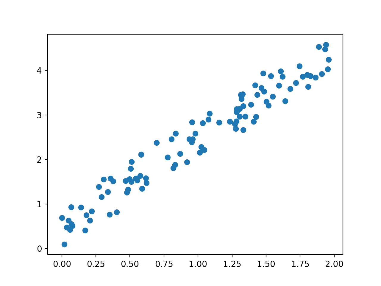
The most commonly used plot is the scatter plot, see the following scripts that generate random number and plot
import matplotlib.pyplot as plt
import numpy as np
n = 100
x = 2 * np.random.rand(n)
y=2*x+np.random.rand(n)
plt.scatter(x, y)
plt.show(block=False)
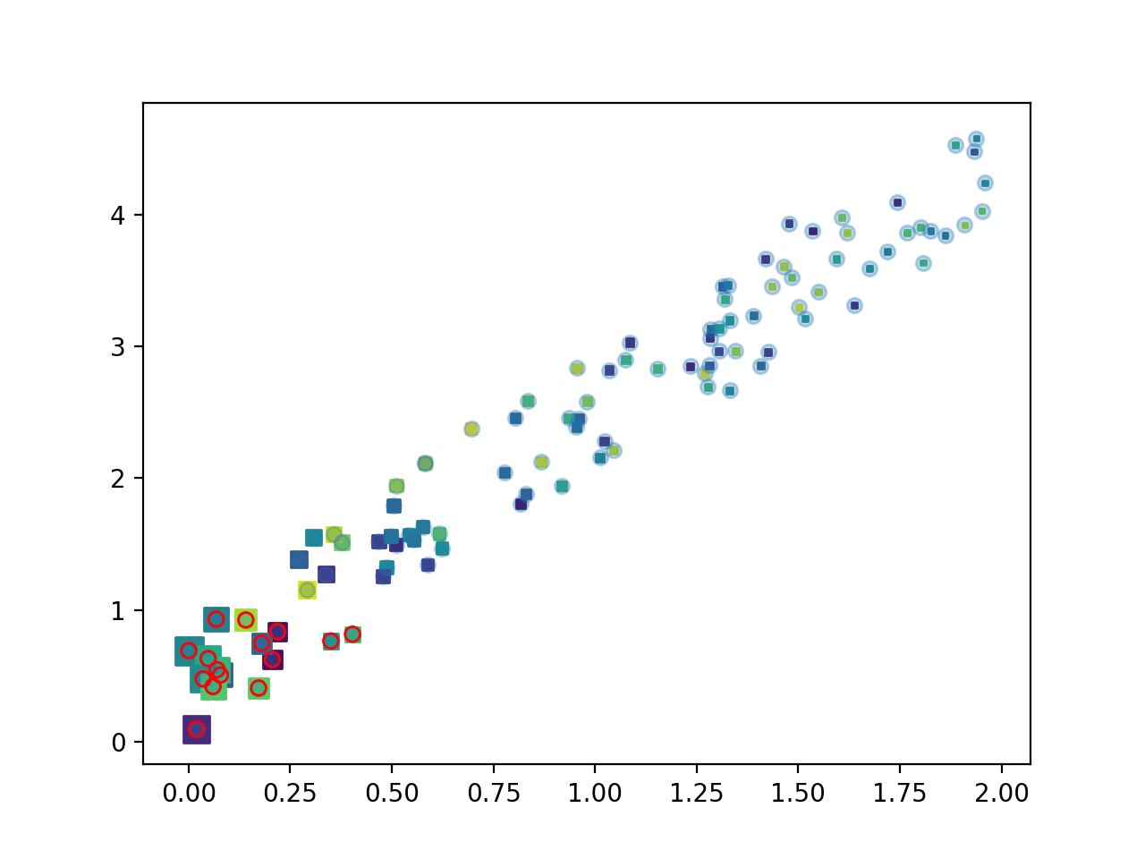
The scatter plot can be presented using different arguments, the size of point, colour, marker different character for points.
colors = np.random.rand(n)
plt.scatter(x, y, s=20 /(x+.4)**2 , c=colors, marker="s")
plt.show(block=False)
xy=x**2+y**2
select=xy<1
plt.scatter(x, y, alpha=0.3)
plt.scatter(x[select], y[select],facecolor='none',edgecolors='r')
plt.show()
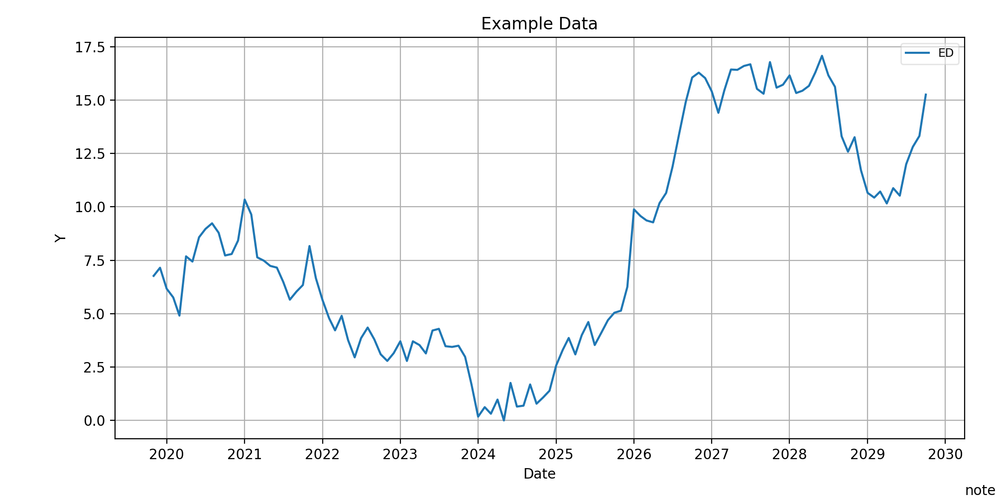
line
Using plt.plot can plot the line, to explain let consider timesries:
import pandas as pd
x=pd.period_range('2019-11-06', periods=12*10,freq='M').to_timestamp()
y = np.random.randn(len(x)).cumsum()
y=abs(min(y))+y
plt.plot(x, y, label='ED')
plt.title('Example Data')
plt.xlabel('Date')
plt.ylabel('Y')
plt.grid(True)
plt.figtext(1,0, 'note',ha='right', va='bottom')
plt.legend(loc='best', framealpha=0.5,prop={'size':'small'})
plt.tight_layout(pad=1)
plt.gcf().set_size_inches(10, 5)
plt.show(block=False)
plt.close()
< img src="https://raw.githubusercontent.com/saeidamiri1/myblog/master/public/image/Figure-2019-12-30-plot-3.png" width="350" height="300" >
Example: Write a function to plot the following function $$ f(x) = \begin{cases} sin(x), & x\leq \pi/2,\ cos(x) & x> \pi/2.\ \end{cases} $$
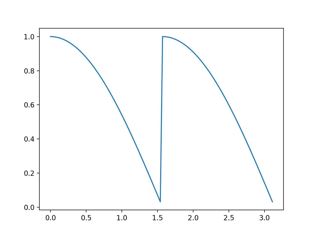
The other approach is to use two function instead one, it can be done using the following script,
x=np.arange(0,np.pi,np.pi/100)
y=np.where(x<np.pi/2,np.cos(x),np.sin(x))
x0=x[x<np.pi/2]
plt.plot(x0,np.cos(x0), linestyle='--',label='cos(x)')
plt.axis([0,np.pi,0,1])
x1=x[(x>=np.pi/2)]
plt.plot(x1,np.sin(x1), linestyle='--',label='sin(x)')
plt.legend()
# it can be done using
# plt.plot(x0,np.cos(x0), '--',x1,np.sin(x1), '--')
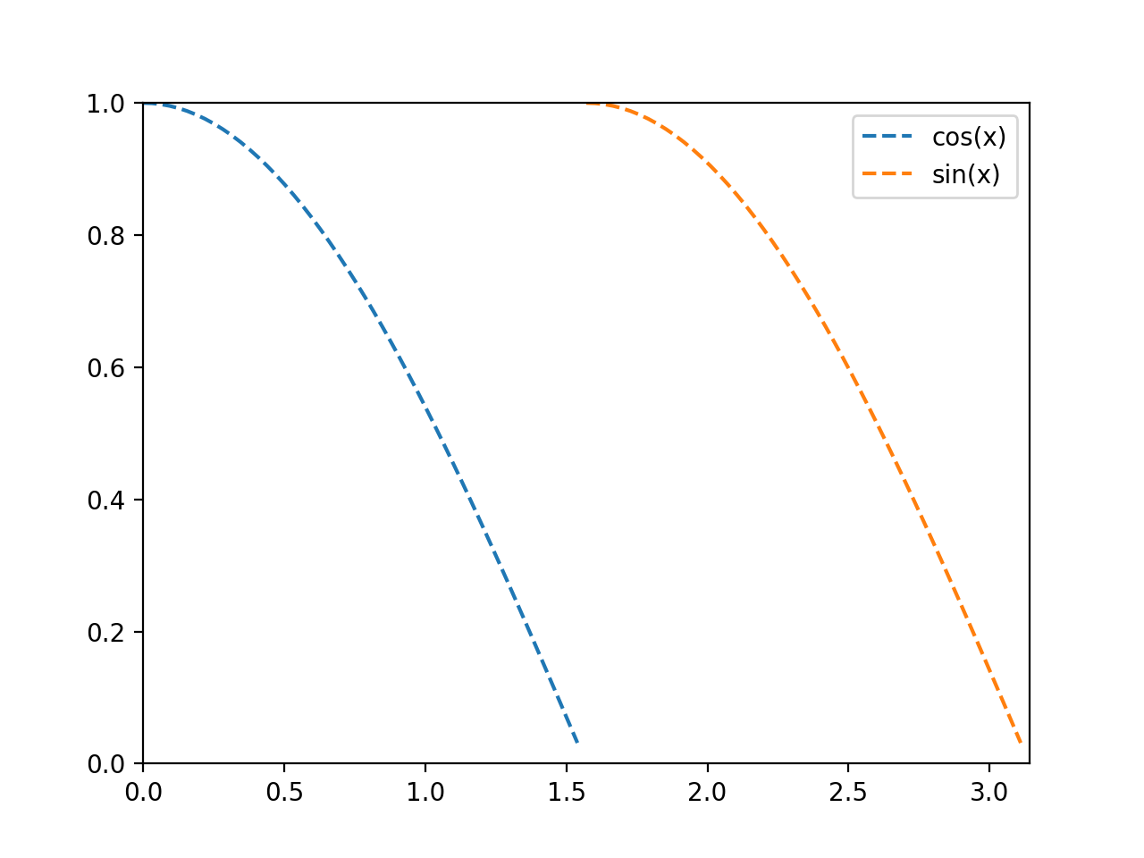
The argument plt.axis() defines axes limits, it can also be done using plt.xlim(,), plt.ylim(,). The style of line is define in '--', other styles are
Type| Description --- | --- | '-' or 'solid'| solid line '--' or 'dashed'| dashed line '-.' or 'dashdot'| dash-dotted line ':' or 'dotted'| dotted line 'None' or ' ' | draw nothing
There are more options for axis, for instance plt.axis('equal') and plt.axis('tight').
The labels and title can be added to plot using plt.axes(),
plt.axes(xlim=(0, 10), ylim=(-2, 2),xlabel='x', ylabel='sin(x)', title='A Simple Plot')
plt.plot(x, np.sin(x), '-')
plt.show(block=False)
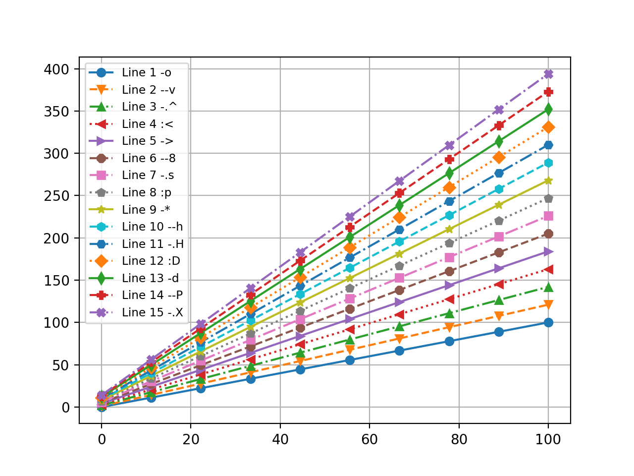
The following plot lines with different markers
n = 15
linestyles = ['-', '--', '-.', ':']
markers = list('ov^<>8sp*hHDdPX')
x = np.linspace(0, 100, 10)
for i in range(n):
  y = x + x/5*i + i
  st = linestyles[i % len(linestyles)]
  ma = markers[i % len(markers)]
  plt.plot(x, y,label='Line '+str(i+1)+' '+st+ma, marker=ma,linestyle=st)

plt.grid(True)
plt.axis('tight')
plt.legend(loc='best', prop={'size':'small'})
plt.show(block=False)
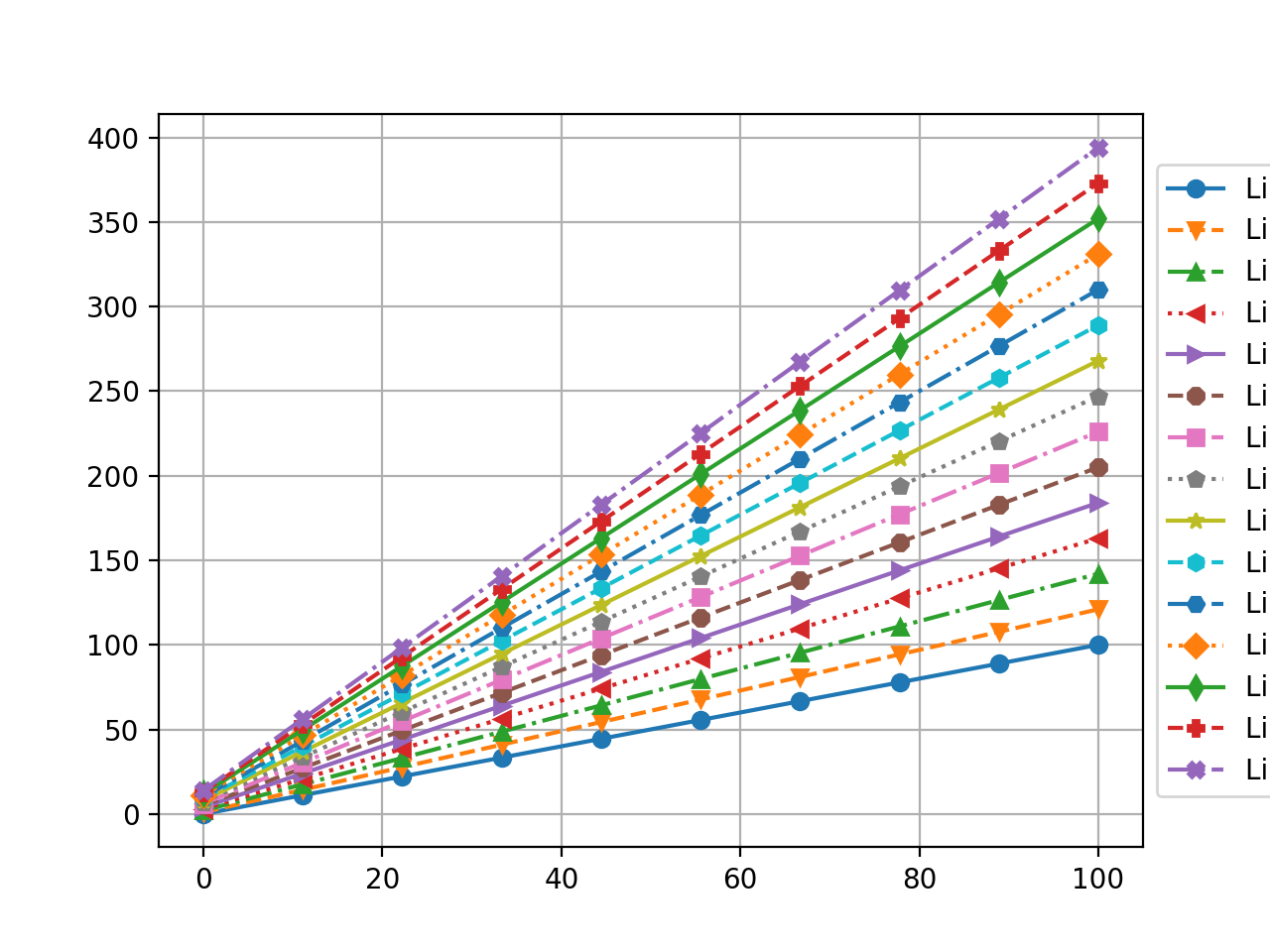
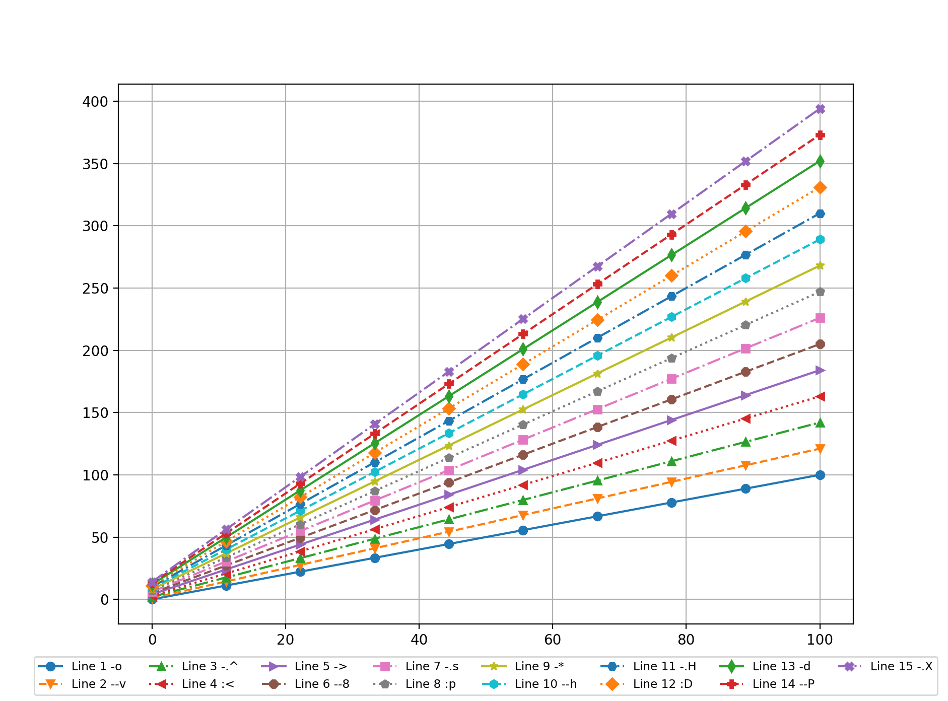
The legend can be moved to different positions.
plt.legend(bbox_to_anchor=(1, 0.5), loc='center left', prop={'size':'small'})
plt.legend(bbox_to_anchor=(0.5, -0.05),loc='upper center', ncol=8, prop={'size':'small'})
Note: if you want to save the figure to a file, put the script between
subplot
Figures can be plotted in one figure using .subplot(#row,#col,position),
x = np.linspace(0, 16, 800)
plt.subplot(2, 2, 1)
plt.plot(x, np.sin(x))
plt.title("Fig1")
plt.xlim(0,1.5*np.pi)
plt.xlabel("X-axis")
plt.ylabel("sin(x)")
plt.subplot(2, 2, 2)
plt.plot(x, np.cos(x))
plt.subplot(2, 2, 3)
plt.plot(x, np.sin(x)*np.cos(x))
plt.subplot(2, 2, 4)
plt.plot(x, np.sin(x)+np.cos(x))
plt.show(block=False)
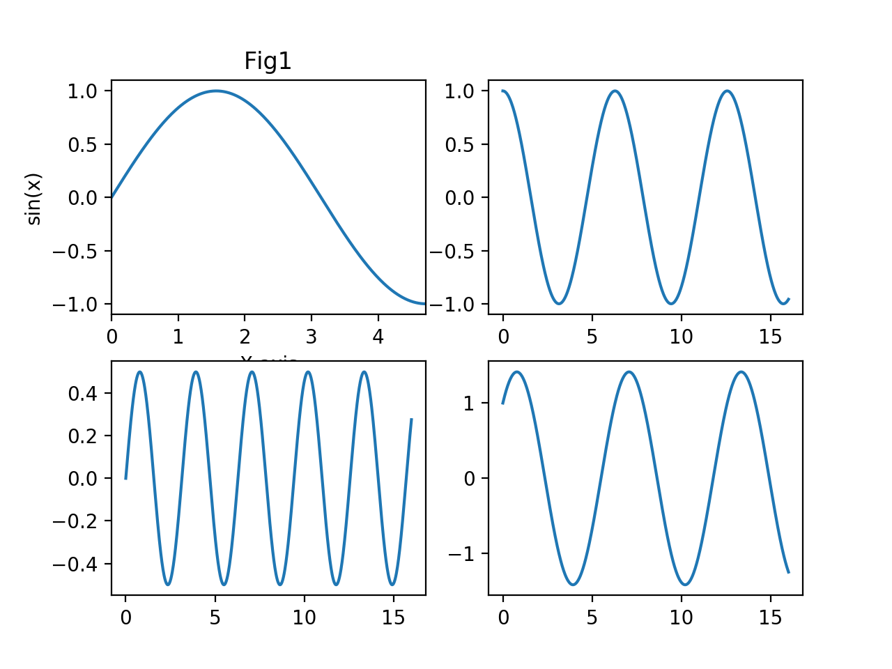
You can not use plt.axes() for subplot.
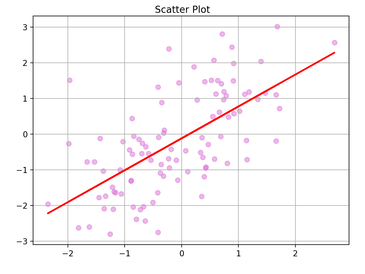
Example: Fit a linear model to a sample data.
x = np.random.randn(100)
y = x + np.random.randn(100)
fig, ax = plt.subplots()
ax.scatter(x, y, alpha=0.5, color='orchid')
fig.suptitle('Scatter Plot')
fig.tight_layout(pad=2);
ax.grid(True)
fit = np.polyfit(x, y, deg=1)
ax.plot(x, fit[0]*x + fit[1], '-',color='red', linewidth=2)
Pythonic approach
The following codes show how pythonic approach can be applied to generate several plots; first generate an empty figure from the global Figure factory, then generate your plots and assign to figure.
fig = plt.figure()
for i in range(1,10):
  x=pd.period_range('2019-11-06', periods=12*10,freq='M').to_timestamp()
  y = np.random.randn(len(x)).cumsum()
  y=abs(min(y))+y
  plt.plot(x, y, label='ED%s'%i)
  plt.title('Example Data')
  plt.xlabel('Date')
  plt.ylabel('Y')
  plt.grid(True)
  plt.legend(loc='best', framealpha=0.5,prop={'size':'small'})
  fig = plt.figure(i) # get the figure
plt.show(block=False)
you can close figures according the number plt.close(fig.number), all figures plt.close(all), ro the current one plt.close()
Plotnine
Plotnine is actually a implemetation of R's ggplot2 which has strong tool. The following codes show the scatter plot using qqplot2